Working with one of our clients, I came across this article from a partner on the team. It is a pleasure to work with such a high caliber team: Blue State Digital. I agree with the blog post, so, decided to share it with you this week. Enjoy.
It can be fun to chuckle at “artist conceptions” created in the past. Google is teeming with images from the last 400-plus years, showing all manner of flying machines, spacemen, variations of the wheel, and telepresence devices. From the work of Jules Verne and Hartmut Esslinger to far less clairvoyant visionaries working for Punch’s, Popular Mechanics, or multinational corporations, value has long been seen in having designers visualize “that which could be.”
Too often, however, web designers only look to the past — site traffic, established user behaviors, predetermined campaign benchmarks, and so forth. While this process is necessary (and often fascinating), it does little to help your organization figure out where it’s going, especially if you’re mired in internal decision-making challenges that might well be a product of that history.
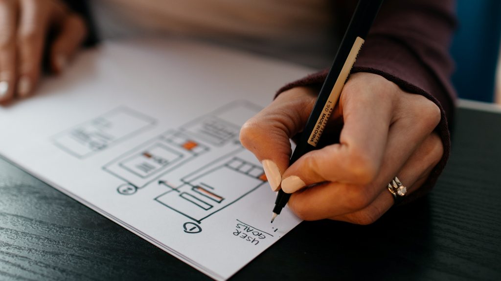
In cases like these, quickly executed glimpses into the future, in the form of vision concepts and website mockups, can have the biggest impact, and get the ball rolling toward real trans-formative change.
The hard part, of course, is grounding these visionary exercises in the real world. Here are some tips for doing just that.
Step #1: See what flies.
A new logo or tagline? A new color palette? Try these things out, while containing them in a process separate from a redesign or site realignment.
Sometimes a well liked, but risky or imaginative concept won’t fly (Like Verne’s Albatross), but they can still spark the imagination enough to greatly inspire a final design, and in some cases they can make hidden challenges known.
Tip: Site analytics can and should be part of this initial creative process. For example, if your users are clamoring for photos, maybe your website could be built around dramatic, but well tagged and categorized photography or slideshows.
Step #2: Do your research, but don’t be a slave to it.
When designing for the future, don’t be afraid of the past. A quick visit to the Wayback Machine at archive.org can give valuable (and entertaining) insight. Some of the best designs come from long-forgotten notions surrounding the original mission of the organization.
This research can also serve as a catalyst for change: It can help get people ready for the next step. Many of these hints from the past can be subtly referenced in a radical new design, while paying homage to historical sensitivities.
Keep in mind, however, that as objectives change, so do user paths and audiences — not to mention hardware.
Tip: Looking simply at home page evolution is a great way to start a conversation about the relative or perceived importance of different parts of the site.
Step #3: Set clear expectations and goals, and remember the bottom line.
After the research phase is completed, set a few ground rules: information density, preferred user path, overall brand consideration, and so forth.
Remember that the goal of conceptual prototyping isn’t to launch a website — it’s a trial of possibilities, and expectations must be set as such. It’s a way to quickly try new and different things, without the baggage and limitations imposed by everyday organizational or political constraints.
If expectations are set early on for how success is measured, this type of future-focused engagement could help improve and evolve your current site, while building excitement around future initiatives.
Tip: After the process is complete, some concepts may provoke negative responses. Use them. Think about the problem in a different way — ask questions you never had to ask before.

